AIG Insurance Account 360 Portal Design
The Prompt
At AIG Insurance, the Pricing and Actuarial team wanted a portal where they could access critical information to perform their day to day function: determining and modifying pricing on existing and future contracts.
The final AC 360 Portal
AC 360 Backgrounder
Account 360 is a Portfolio management tool which provides comprehensive view of account performance in the form of dashboard reporting. It provides the risk insights to the underwriters to make smart pricing, coverage, and service decisions with each transaction. The system provides the details of the Insured, Premium details, Coverage details, Rate Monitoring and various Loss Reports.
Pain Points
Each of the details mentioned above (Insured, Premium details, Coverage details, Rate Monitoring and various Loss Reports) were available across multiple systems. Users had to access multiple systems at once to view all the required information. Often times, the data within each system was not updated and relationships between multiple data points was conspicuously absent, resulting in a sub par user experience.
Disconnected Data points
information Architecture
The users were clear as to the sections they wanted -- which is reflected in the simple sitemap that I created. The dashboard, highlighted in yellow, was to be the first section to be tackled.
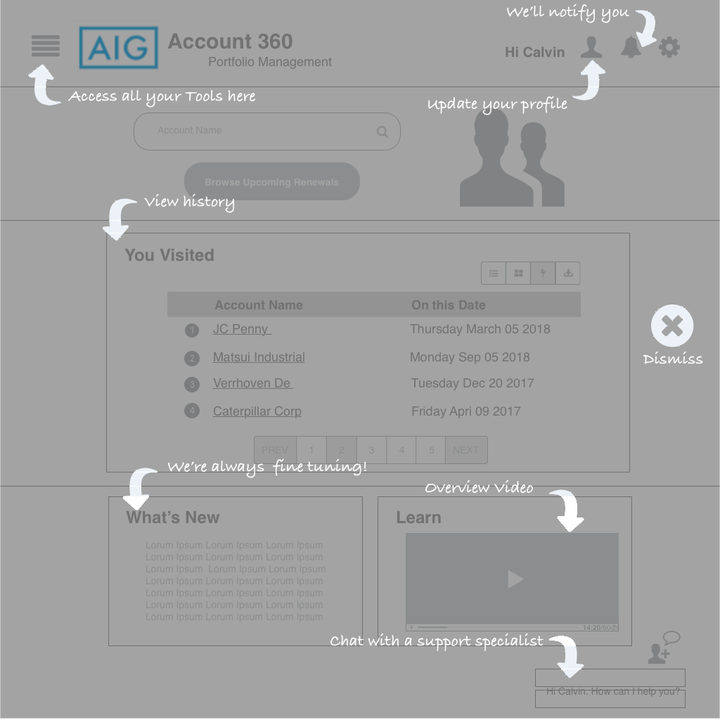
Initial Wireframes


Usability Test results
Users performed a usability test on a clickable prototype using the wireframes above. Some results:
- The Navicon bar was not popular; users wanted to see all the menu options up front.
- There was not much customization to be had, so loosing the settings option was imperative
- Tutorials needed to be created, which would have taken some effort. So it was decided that for Phase 1, the Learn option was a no-go
- Having a photo of an arbitrary user on the home page was not in line with AIG guidelines. So the photo had to be removed.
- The chat bot was a no-go for Phase 1, so had to be removed.
- Otherwise, users liked the general layout and the information architecture.
Mockups
Based on the usability test results, I came up with another design that employed classic AIG colors. Shown below is the Dashboard, Dashboard with drop down options (requested by the stakeholder) and the Home Page.
Next Steps
I provided an end to end clickable prototype (involving at least 30 screens) of the portal in Invision. Phase 1 will use the mockups presented above. Phase 2 will involve responsive design for tablet and phone form factors. Phase 3 will involve creating native apps for iOS and Android.


